Devlog 3 - Making things less hideous
Visual appeal and style aren't particularly important in the early stages of game development. Your game should be in such a fluid state that any time spent refining visual components could potentially be wasted, as the thing you're refining might no longer exist by the time you want other people to look at your game.
However, it's fun to make things pretty.
Going flat
Up until now, my map has been a grid of tiles that the characters move across.
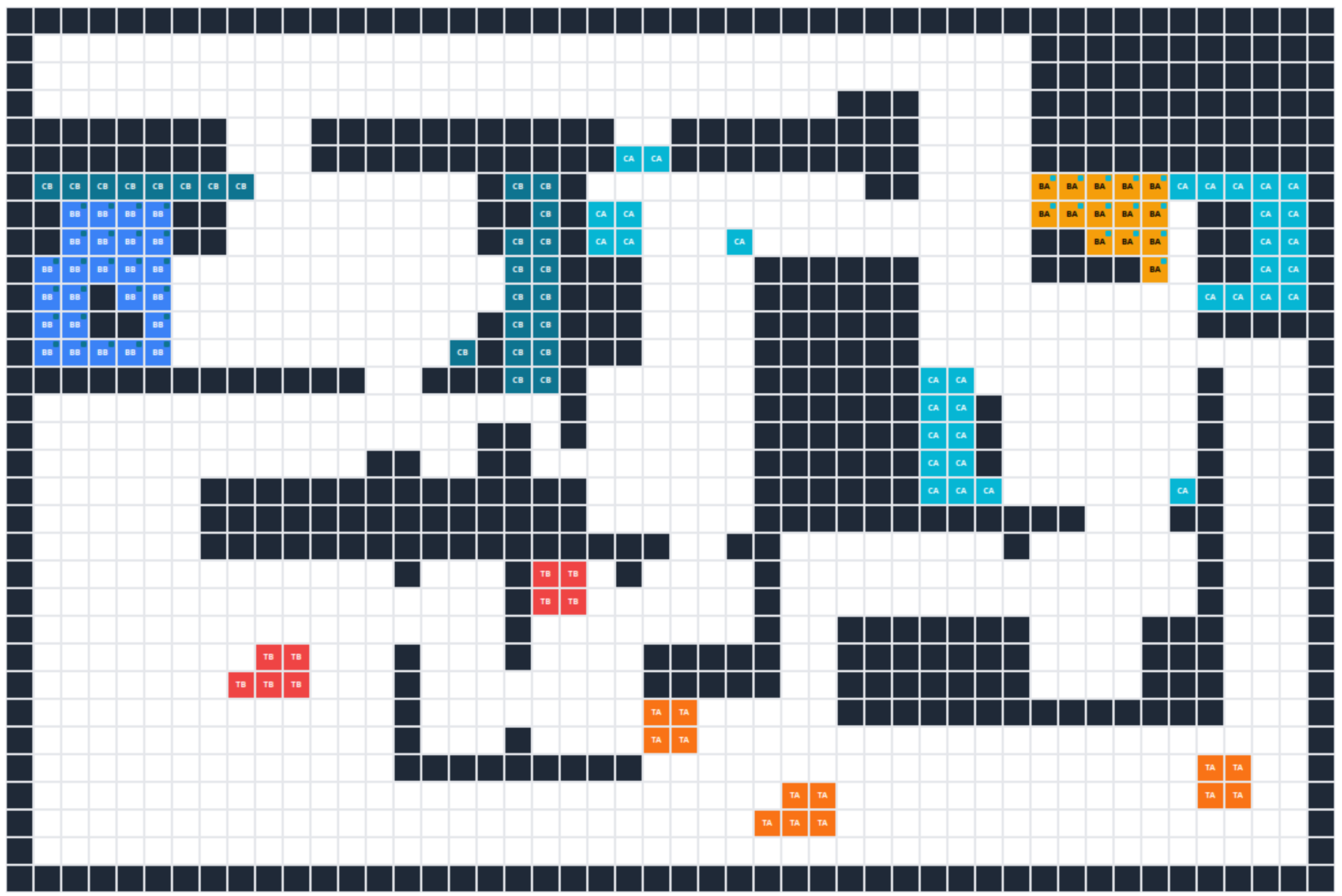
I found the sheer number of lines on my screen quite overwhelming (I'm a sensitive little flower), so I wanted to make the map a bit simpler visually. To do this, I used Inkscape, a free, open-source tool similar to Adobe Illustrator. It's not particularly suited to game dev art; it's just a tool that I have experience using. I picked a colour palette from Lospec and created this...
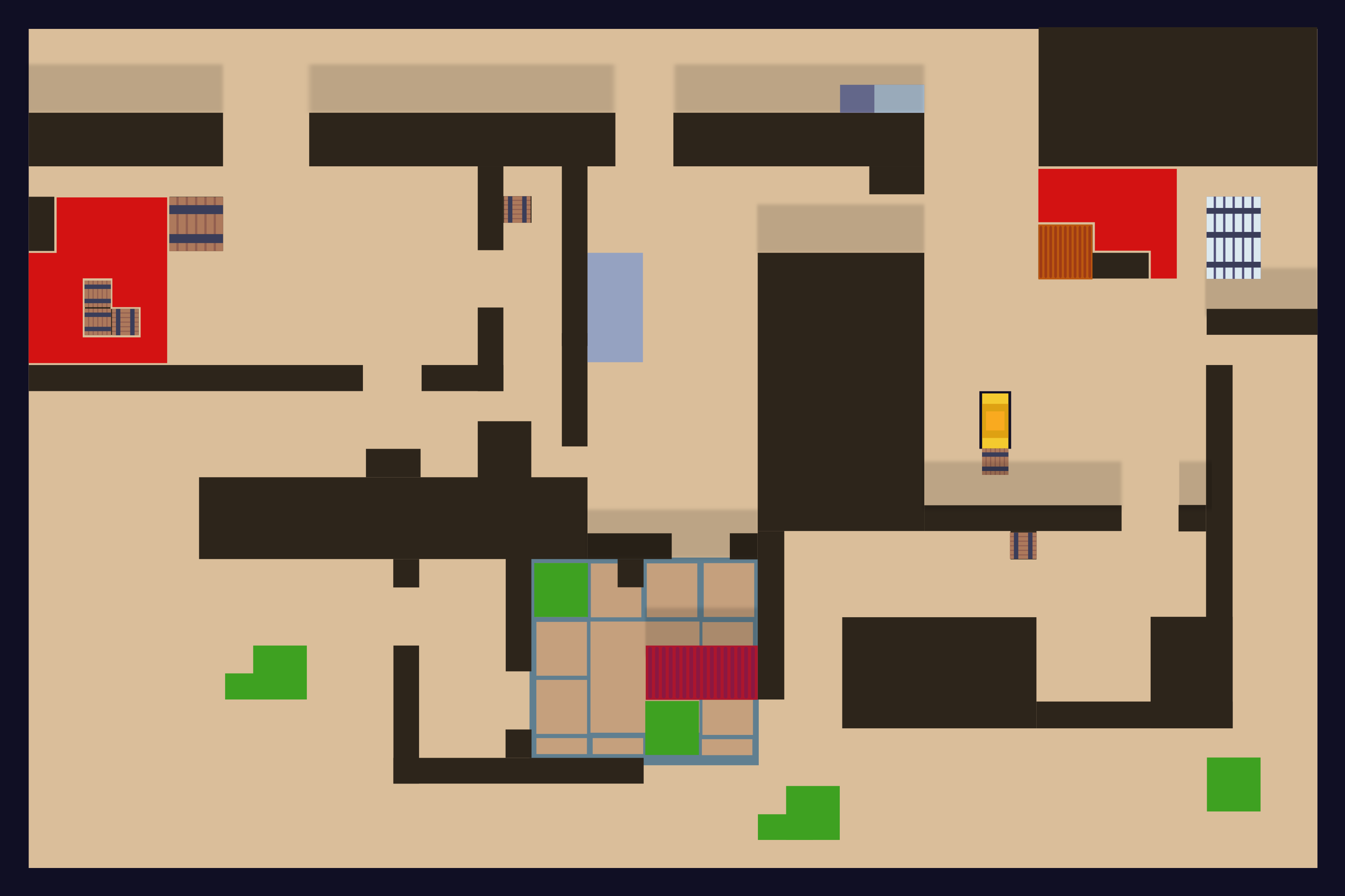
It was kind of fine? It did the job of making things a bit easier on the eyes, but it didn't offer much beyond that. That's when I had a THOUGHT and decided to experiment with a 2.5D perspective.
Transitioning from 2D to 2.5D (not the kind of D growth my WIFE wants, am I right, lads??)
I can't find a concrete name for this style of perspective, but people apparently also call it oblique perspective, three-quarter top-down, or pseudo-isometric.
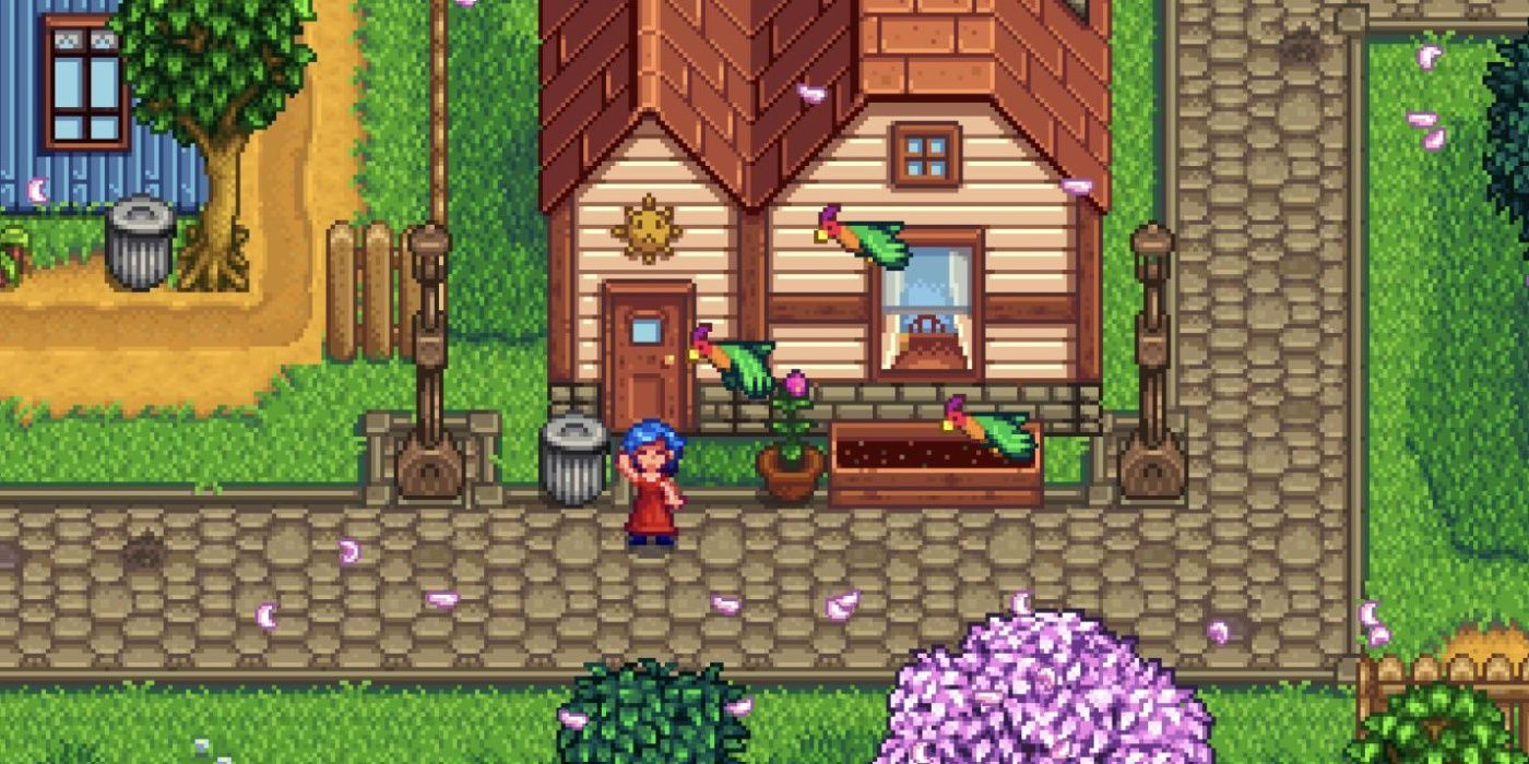
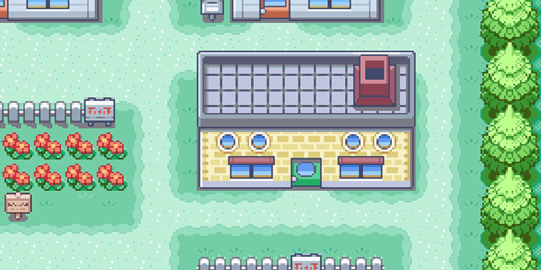
It's basically top-down, but you can see the fronts of objects too. Here are some examples.
Stardew Valley
Pokémon
Cool. This means that, whereas previously the camera was top-down and could only see the ceilings of things, it now has to see the walls too.
Since we've already got the ceilings, it's just a case of adding the walls, right? Unfortunately not.
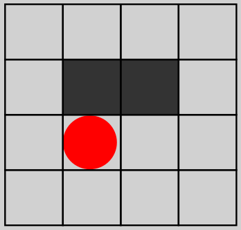
This is our current view. We can see the character and the top of the wall.
If we simply added the front face to the top face of this wall, the wall would need to take up additional space.
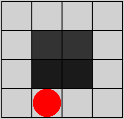
This would change the whole layout of the map, which we cannot do.
So, what we need to do is add this visual information without taking up any more space. In other words, the ceiling and face of the wall have to occupy the same amount of space as the ceiling currently does.
That looks a little like this:
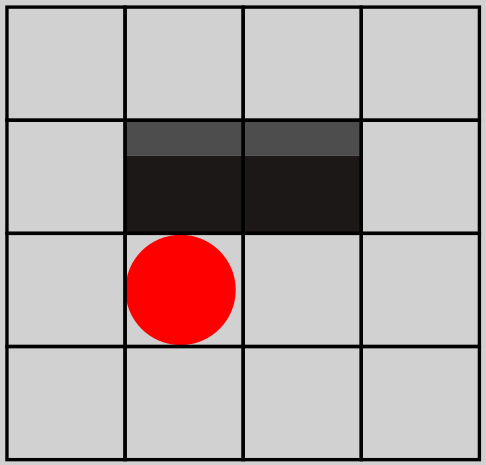
Okay, that's better. It's only taking up one tile, and if we use our imagination, we can see it as a wall. We can add a little more visual information to make this work a bit better.
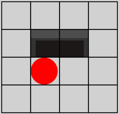
Better! And if we remove those HORRID lines, we get this:
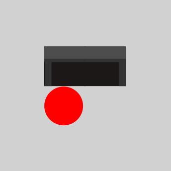
Wow. Pretty incredible stuff. My favourite bit was when the image sizes kept changing.
Let's take that same approach and apply it to the flat-looking map.
Before:
After:
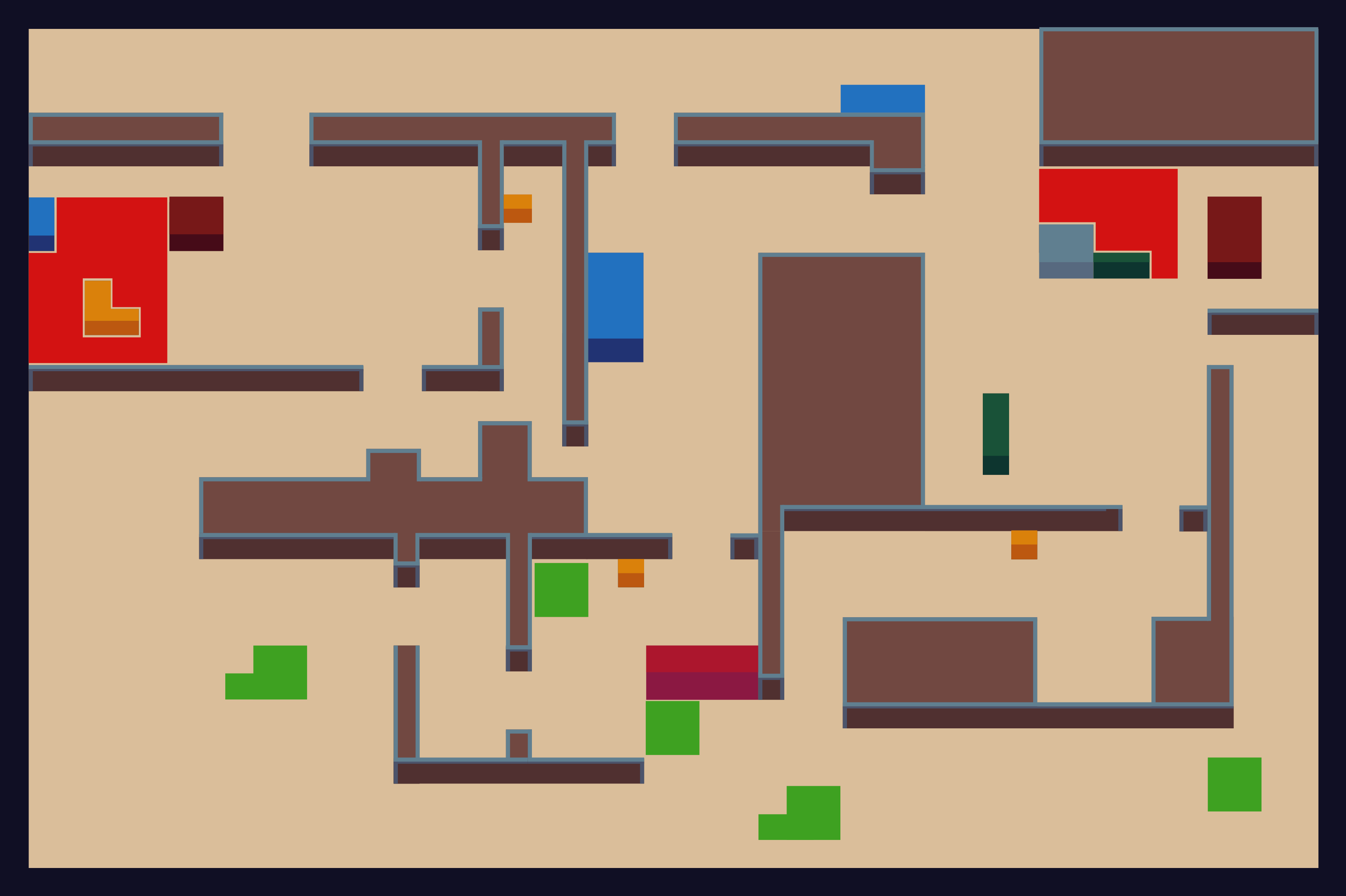
I can't believe it. It feels like I could step right into that lil thing, goddamn.
Now, this isn't the final colour palette, but I think it works for the moment. Since it's in Inkscape, we can easily union all the shapes and change their colour until we're happy. By using words like "we" and "we're," I'm putting a portion of the responsibility on you here.